A well-balanced design positions the Volkswagen ID.3 as an electric model suitable for all, writes Michael Nash
Having recently unveiled the new ID.4 and more powerful ID.4 GTX, Volkswagen is clearly pushing forward with its electrification offensive, hoping to bring functional and affordable electric cars to the masses. Back in 2019, the company first unveiled its ID.3, which Car Design News contributor Guy Bird described as ”Volkswagen’s most important new car since the original Golf.” The model has since featured in Interior Motives magazine, and now we get behind the wheel for an in-depth design review.
Shape shifting
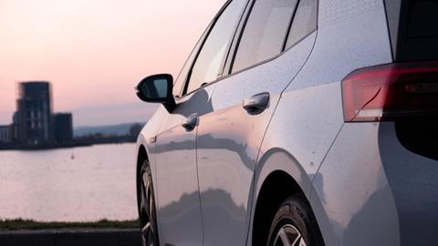
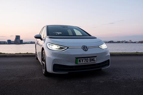
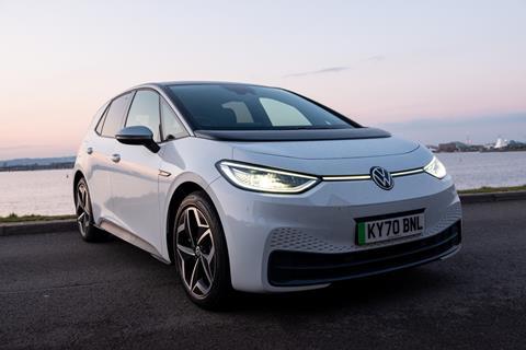
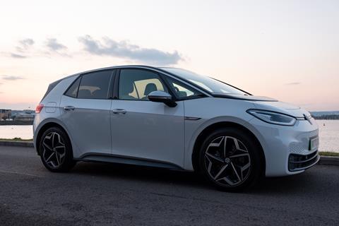
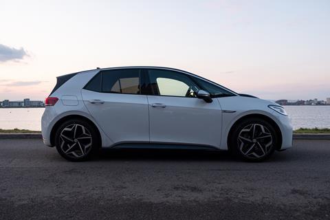
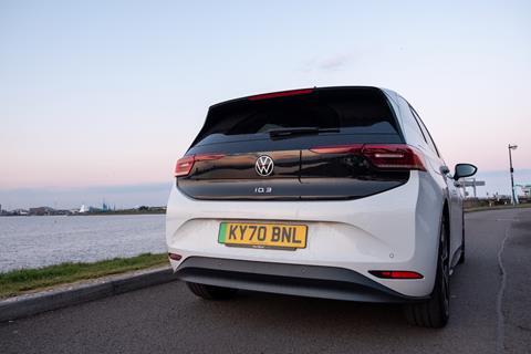
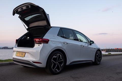
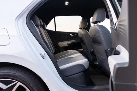
A quick glance at the ID.3’s shape and styling may initially result in some head scratching. It is, according to VW, a hatchback coming in at almost exactly the same size as a Golf in overall length and width. However, as the batteries and motors are under the floor, there is no need for a big front end. Instead, the car is 17cm taller and the wheelbase has been stretched (2765mm compared to 2636mm), making the inside far roomier with ample space for the family. A very short bonnet and almost no overhang at the back, along with the increase in height, gives the ID.3 a distinctive boxy appearance.
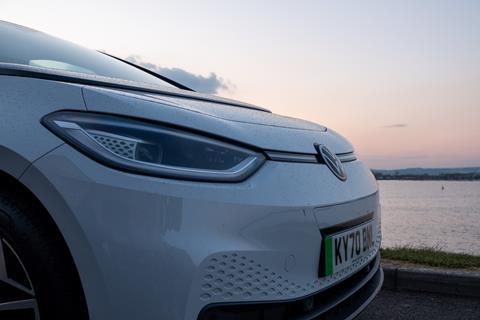
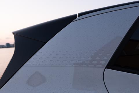
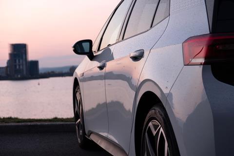
The front end is characterised by the lighting, with LEDs outlining the main lamps and continuing into the centre to meet the VW logo. The curve reflects the shape of the bonnet above as well as the lip on the body work below. This line continues around the entire car, creating the low-running belt line on the sides and dissecting the lights at the rear – a very simple yet pleasing way of tying everything together. Behind the main lamps are small diamond-patterned light graphics, matching the shapes punched into body work on the front bumper and on the grey strips behind the rear passenger windows.
So far, so good, but it gets a little murky when noticing the panel below the windscreen. This matte black area encroaches into the bonnet space and is meant to be a continuation of the black roof design. The more you look at it, the harder it is to see anything else. Perhaps it makes the bonnet appear shorter and the roof longer, but it does seem like an unnecessary addition to an otherwise clean and uncomplicated exterior design.
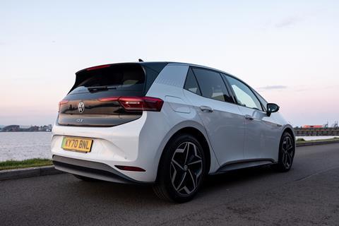
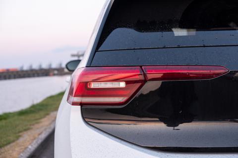
Then there is the body work at the back. The shape of the boot lid and bumper are all over the place, as is evidenced in the edges that separate the back from the sides. However, a lifeline is thrown in the form of some simple rear lamps that scale back the chaos. A hooded rear window attempts to provide a injection of sportiness, and like the panel on the front bonnet, adds to the length of the roof.
Overriding auto pilot
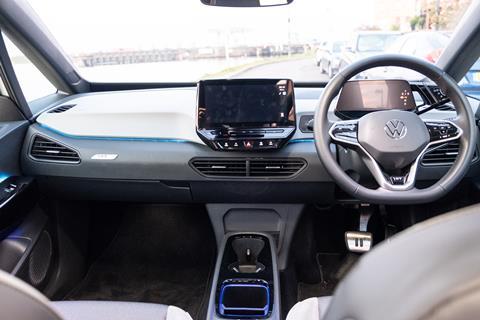
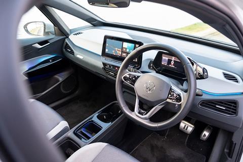
Volkswagen’s interior design team clearly took a reductionist approach when creating the inside of the ID.3. There are barely any buttons apart from those on the steering wheel and a small cluster to change the mirrors. The climate controls under the 10-inch centre screen are touch-sensitive but provide no haptic feedback. They feel a little alien at first but soon become familiar. Everything else is accessed via the touchscreen, which floats on top of the dash, and is a little chunky in its glossy-black housing when compared to some of the slimmer touchscreens on the market today.
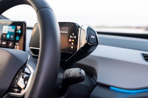
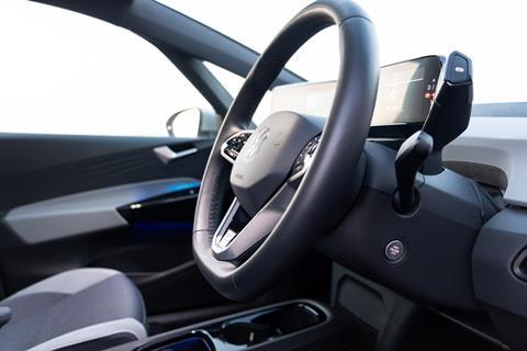
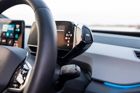
Another small screen sits behind the steering wheel to provide the driver with information and is also wrapped in a glossy-black case. Stemming off to one side is the rotary gear selector, with ‘drive’, ‘neutral’ and ‘reverse’ options as well as a ‘park’ button. It’s similar to the one on the BMW i3, but instead is attached to the digital driver display rather than the base of the steering wheel.
Automatically reaching down to the centre console in order to reverse of park became slightly frustrating. Good design is always informed by user experience, and years of driving with a gear stick on the centre console has rendered the experience of driving the VW ID.3 somewhat unnatural. But, in my mind, change isn’t a bad thing providing it serves a purpose. VW’s designers may argue that it makes more sense for the gear selector to be positioned up ahead of the driver to ensure eyes are kept on the road, although this shouldn’t be an issue with seasoned drivers that are so used to the gear stick being on the centre console that they don’t need to look for it.
Perhaps, then, the positioning of the gear selector makes more sense for new drivers that are unsure, and thinking of the bigger picture, we are all relatively new to fully electric models that have no gears. And, just like the touch-sensitive climate controls, time and consistent use of a gear selector in this new position would surely make it far natural.
Gloss dominates
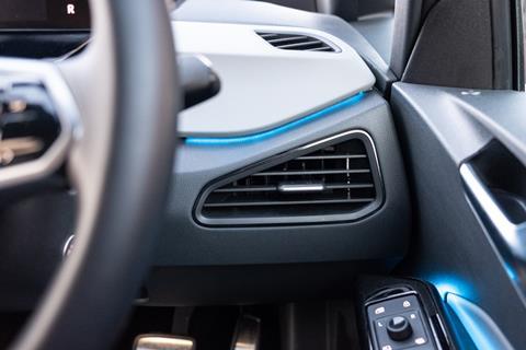
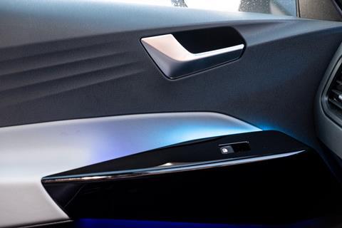
Most of the functional components, like the touch-sensitive climate controls, steering wheel buttons and gear selector, have been finished in the glossy black plastic that feels nice to touch. It is also used on the inner section of the centre console and a small area of the doors that surrounds the window switches. The door handles and parts of the air vents are chrome, which makes for a welcome change.
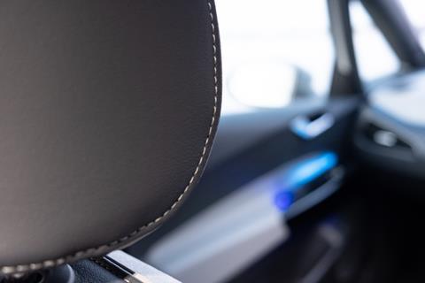
Another welcome change comes in the form of the ambient lighting. A calming glow emanates from underneath the middle section of the dash, creating a beautiful contrast between the different colours of the middle and lower sections. There are also ambient lights highlighting the glossy section of the doors and in the storage area of the centre console.
Elsewhere, the interior takes on a functional and simplistic nature. Hard plastics clad the majority of large surface areas, with the exception of leather inserts on the doors that are finished in the same colour as the middle of the dash. The hard plastic upper section of the doors are slightly unusual due to the ridges that sweep upwards towards the A- and B-pillars.
Best of both worlds
Looking at the ID.3, it would be tempting to suggest that the car is a city-dwellers companion, with a small and manoeuvrable body that comes with the benefit of zero local emissions. And although it does perform brilliantly in urban areas, it is also perfectly suitable for country roads and on longer journeys.
Our test car came with a 58kWh battery pack capable of delivering 263 miles of range on a full charge – more than enough to get out of the city for the day. VW also offers a 77kWh option with a range of 336 miles (just about enough to drive from London to Cardiff and back in theory, although driving at motorway speeds will likely make this unachievable without stopping to charge). Range anxiety is, therefore, nearly non-existent. Nearly, not entirely.
As well as different battery packs, VW also offers various trim levels and optional extras for the ID.3. The entry level is titled ‘City’ and, although it is bottom of the pile, it doesn’t lack for design details or equipment. It includes the diamond-shaped LED light patterns at the front, the ambient lighting inside, and a host of driver assistance systems like adaptive cruise control and a driver alert system with fatigue detection.
The ’Family’, ‘Tech’ and ‘Max’ trims can be fitted with a ‘design pack plus’. This includes what VW calls its “IQ. Light” – a system first seen on the third generation Tourag that automatically dips the beams when necessary at night. The design pack also includes an animation on the rear lamps, 30 different colour options to jazz-up the ambient lighting in the doors and dash, a panoramic sunroof, and rear tinted glass.
There may be a few questionable design details on the ID.3, but Volkswagen has nailed the functional and practical aspects of the car. It may now be simply a task of exposure – the more people that experience the ID.3 and life with a well-rounded electric car, the quicker uptake will be.






No comments yet