From peak button to peak screen (and everything in between), Wayne Batty takes a canter through the last 20 years of interiors
At the turn of the century, the digital revolution was already well under way and threatening to reshape our existence in myriad ways. While the much-hyped ‘millennium bug’ failed to materialise, the world of new millennium car interiors was about to hit the cull switch on its button infestation.
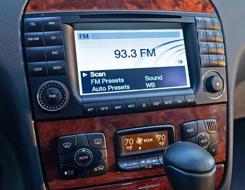
The 1999 model year Mercedes-Benz W220 S-class was a technological tour de force that could be specified with as many as 170 motors packed into its elegant Sacco-Mattin body. With everything from heated headlight washers via actively ventilated seats and self-closing doors to bootlid being powered, plus a whole new language of features such as Distronic, Parktronic and Linguatronic to experience, it’s easy to understand why the cabin was confetti-gun-littered with buttons.
Just the Comand system alone featured two rotary switches and 31 buttons bordering its 6.5-inch colour display. It wasn’t just Mercedes playing equipment Tetris; it seemed every carmaker was addicted. Before long, you could have voice-controlled sat-nav in your Punto.
We arrived at that level of button proliferation due to the industry’s aforementioned one-upmanship and the classic Change of Use scenario. With ever more congested roads, the entertainment provided by the driving experience itself was disappearing. By simply driving less and commuting more, comfort, convenience and in-car entertainment became core focus areas of interior design. In short, we were using our cars differently.
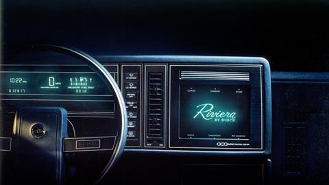
First tried by GM in a 1986 Buick Riviera, the touchscreen proved unpopular – too avant-garde?
Even the oft-ridiculed cupholders, an American staple since the mid-1980s, began to appear in European and Japanese cars – a sure sign that our old cockpits were transforming into mobile lounges, offices and in some cases, dining rooms. The properly spartan cabin of a Lotus 340R, co-incidentally also released in 2000, stands as stark reminder of how little is actually required for driving.
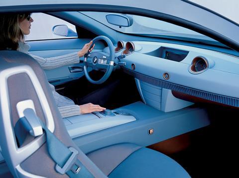
Yet amidst all the marketing fanfare of the S-class features list, Mercedes was already aware that we’d reached peak button. BMW’s Z9 concept (1999) and its ground-breaking Intuitive Interaction Concept – the harbinger of iDrive – had made sure of that. It was, at the very least, a visual cure for buttonpox.
In 2001, BMW released the E65 7 Series, complete with iDrive. In one agricultural swing, Munich had taken a machete to the button count. What’s more, an electronic parking brake and a steering column stalk mounted gear selector liberated enough centre console real estate for two cupholders – talk about a revolution. As it turned out, BMW had cut too deep and so, responding to criticism, added a few dedicated buttons to complement the rotary controller. Regardless, the die had been cast and soon every car maker was following suit. Displays grew larger and menus more complicated with both hardware and software developing apace.
You can’t talk about hard- and soft-ware over the last two decades without mentioning interior plastics and the vast chasm that existed between the throwaway beach bucket quality of an early-2000s Chrysler interior and the slush-moulded dashboards of most VW Group products. These powder-sintered skin moulds offered just the right amount of push-back squishiness. They shone like beacons in a sea of hard and hollow knock-off Tupperware.
I mean who needs five ways to turn up the volume, anyway?
The next step change occurred with the arrival of the touchscreen, democratised by the launch of the epoch-defining iPhone in 2007. First tried by GM in a 1986 Buick Riviera, the touchscreen proved unpopular – too avant-garde? Most likely, but perhaps it also proved incompatible with fingers perpetually coated in McDonald’s finest.
The fingerprint issue hadn’t gone away when touchscreens first reappeared. Not just that, the issue of digital distraction was an even greater cause for concern. Audi’s answer was the touchpad, introduced as MMI Touch on its 2010 A8, a sort of safe halfway house that promised less visual distraction and more intuitive operation.
During the W205 C-class launch in 2014, Mercedes-Benz engineers hinted that, thanks to advances in airbag tech, the touchpad might soon appear on the steering wheel boss. That idea was ditched, but it suggests manufacturers were trying every HMI approach. Mazda’s tactic was to combine touchscreen with rotary controller, leaving it up to the customer to decide. For the tech-averse, it got a little overwhelming.
I mean who needs five ways to turn up the volume, anyway? Rotary knob, touchscreen, button on the steering wheel, voice command and even gesture control? I tried the latter on a prototype Volkswagen at Frankfurt. Once the Jedi mind trick euphoria wore thin (in less than a minute), I found turning a knob or pressing a haptically reassuring virtual button more satisfying.
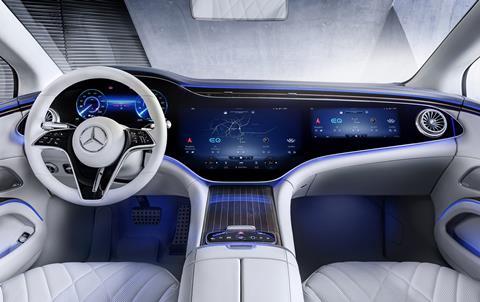
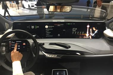
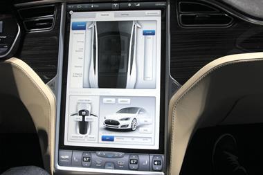
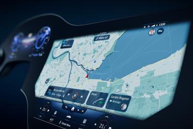
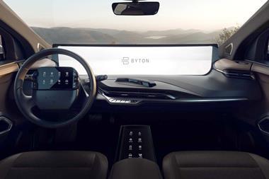
As iPads and tablets became de rigueur, suddenly touchscreens and non-touch displays began popping up everywhere like dashboard erections – third-gen Audi A3, please stand up. But it was the 17-inch screen in the 2013 Tesla Model S that ignited the touchscreen inch race. You’d be hard-pressed not to find one gracing the dashboard of any new car, and in the case of the Mercedes-Benz EQS, the 56-inch MBUX Hyperscreen actually is the dashboard, which begs the question: Have we reached peak screen?
This article first appeared in Interior Motives Summer 2022 edition. You can subscribe here







No comments yet