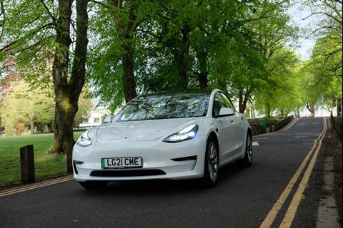
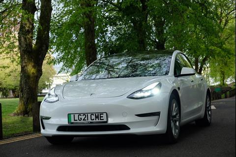
Pushing reductionism to the extreme, the delectable Model 3 shows less can be more. Michael Nash gets behind the wheel of Tesla’s most affordable EV
The Model 3 is the second Tesla I have test driven, following on from the Model S some years back. As such, it is difficult to draw comparisons, but one thing sticks in my mind: the feeling of being behind the wheel. The fastidious of Tesla models is a differentiator. There is a clinical precision, a sense of neatness bordering on perfection that comes as a culmination of design choices. More on that shortly, but first, here is a bit of background.
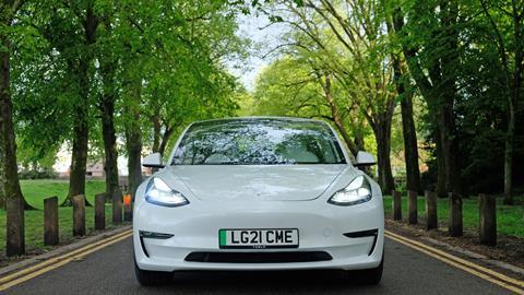
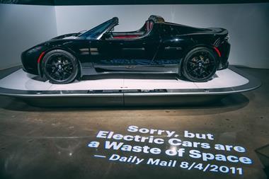
Unveiled back in 2016, the Model 3 was Tesla’s fourth car to hit the market following the Roadster (now discontinued), Model S, and Model X. Speaking at the launch event, chief executive Elon Musk described it as the “final step in the masterplan – a mass-market, affordable car.”
Smaller, a little slower and with less range, the Model 3 has several differences when comparing to the Model S. It also lacks some of the luxuriousness inside that the S boasts, but none of this make the Model 3 any less compelling.
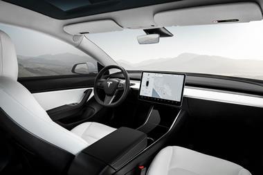
It is 4,694mm long, 1,849mm wide and 1,443mm high. There is plenty of room when sat inside, both in the front and back seats. Leg and head room are ample, but perhaps what makes the Model 3 feel particularly spacious is the distinct reductionist approach to interior design – arguably the most extreme of all current cars on the market.
Simply sumptuous
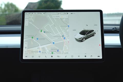
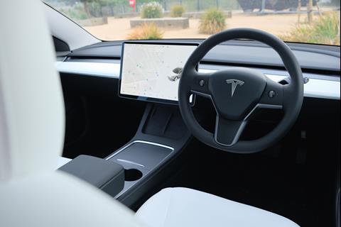
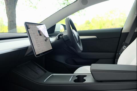
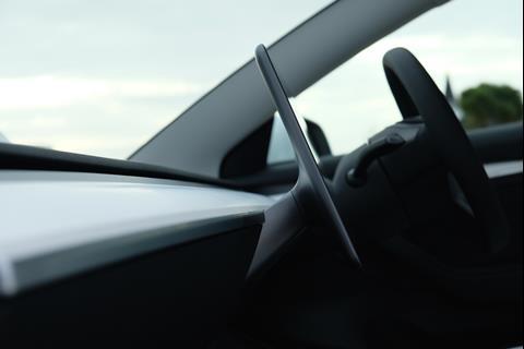
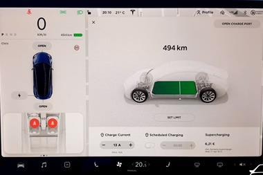
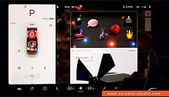
The dash runs uninterrupted from A-pillar to A-pillar, simple and beautiful in its form, without a single button or air vent in sight. It is layered, with the top hard black plastic section giving way for a hollow space that hides the vents. The middle section is clad in leather (white in the case of our test car) with a chrome lip, and the bottom section is again black. Sprouting out the bottom is the giant 15-inch touchscreen, thin and slick with razor-sharp graphics, which is used to control everything from the ambient lighting to the windscreen wiper settings.
Big screens divide opinions. Many consumers are initially wowed when glimpsing inside the Model 3 (and other Tesla’s), but some will likely feel uncomfortable in the driving seat when using the screen to change the temperature. This is true even for the young consumer, although most will likely be quick to learn.
Designers are hesitant to hand over all functionality to screens, with some suggesting that it will result in deep menus that distract drivers and make it hard for them to find what they are after. But those responsible for the user experience (UX) at Tesla have worked hard to make the system as clear and simple to use as possible. At no point during my test of the Model 3 did I find myself at a loss. Instead, functions often seemed to be a single tap, swipe or click of a button (on the steering wheel) away.
There will always be those that question Tesla’s approach to interior design. Drivers today are still used to buttons and dials to control temperature and media volume. But if design stood still, we would soon all get bored. The Model 3 owes much, if not all its character, to the giant, all-encompassing touchscreen. Without it, buttons would likely be placed on the dash, centre console, doors and steering wheel, resulting in a far more reserved approach to reductionism and potentially deeming the interior of the Model 3 impossible to differentiate from others.
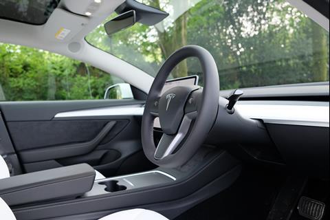
To achieve a cocoon-like cockpit, the white leather on the dash continues halfway along the front doors. There is also a black fabric on the middle section of the doors, soft to touch, though most of it is finished in black leather, complete with detailed stitching running along the arm rest – a classy touch of character in an otherwise bare inside.
There is stitching on the borders of the centre console too and a fabric bed beneath the screen that is big enough for two smart phones to lie side-by-side. It is these minutiae – the carefully selected and measured design details – that give the Model 3 its soul. Without them, it would likely be unwelcoming and unnerving.
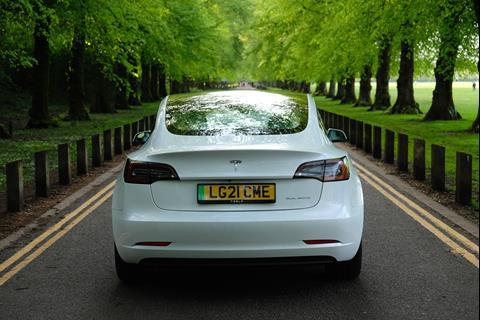
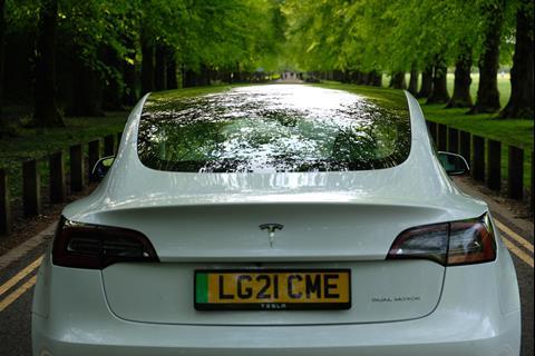
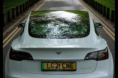
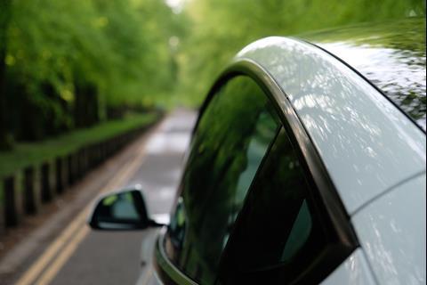
As well as the minimalist aesthetic, the sense of spaciousness is also maximised by the all-glass roof that extends far past the back seats to the boot lid. All of the pillars are fairly substantial in order to support the glass and can get obtrusive particularly when taking corners on small roads.
Picking wisely
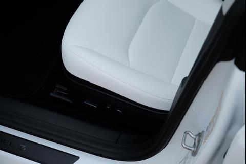
Speaking of cornering, the cushioned vegan leather seats are extremely comfortable and can be adjusted with two electronic switches, but are lacking in side support when cornering at speed. Also, black would probably be a safer bet than the white, even though Tesla says they are “stain resistant.” I personally wouldn’t allow children within two miles of them.
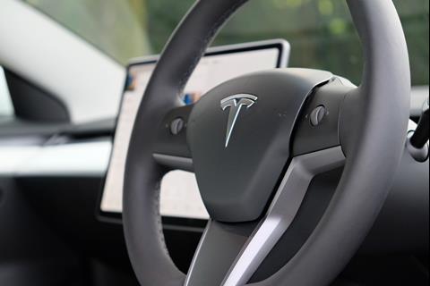
One of the sticking points of the Model 3 is the steering wheel. It feels a little laboured in its design, and although it continues the minimalist approach, it is less elegant than the rest of the interior. Tesla spotted this, and has already designed a new ‘yoke’ steering wheel that will reportedly be introduced on the forthcoming updated Model S and Model X. Let’s hope it makes its way into the Model 3.
For now, though, the design of the steering wheel is soon forgotten when driving. In fact, this is yet another benefit of Tesla’s reductionist approach – everything else is easily forgotten and seems to melt away into the background when the driving starts.
It’s not as powerful as the S, but the Model 3 still packs a very lively punch. Zero to 60mph takes 5.3 seconds and top speed is 140mph. Opt for the Dual Motor Performance set-up and 0-60mph can be achieved in just 3.1 seconds (that’s 1.6 seconds faster than the Polestar 2), while top speed is 162mph. As with any electric car, the most impressive point of acceleration in the Model 3 is from a standing start, and along with hearing the pitch of the motor rise, it’s enough to make you giddy with glee.
Range comes in at 278 miles on a single charge for the basic entry-level model, but the Long Range option with all-wheel drive boasts 360 miles. Our test car was the former, and we managed to cover nearly 200 miles on a mix of dual carriages and B roads without having to charge once. The basic Model 3 has plenty of juice for drivers like me that will only cover long distances once in a blue moon.
On handing back the keys to the Model 3, I was informed by a member of the Tesla team that the updated Model X and Model S would be available to drive in the not-too-distant future, and that the updates include some design changes.





No comments yet