Nissan updates its much loved classic with modern (but not too techy) touches
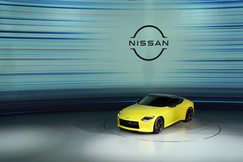
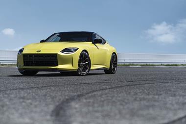
Many people have been waiting a long time for the new Z car, and last night’s online reveal of the Z Proto (a near production concept) gives a good idea of what the new Z will be. Nissan hasn’t strayed too far from Z’s heritage, which will delight a lot of people, and the updates blend old and new neatly in a startling yellow package.
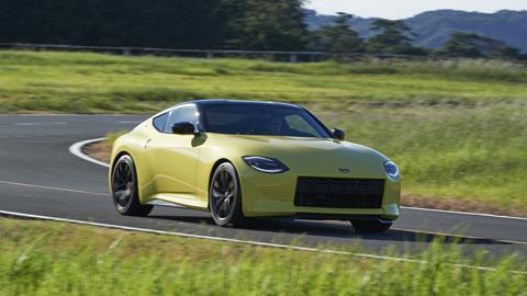
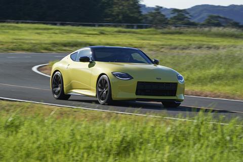
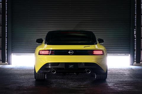
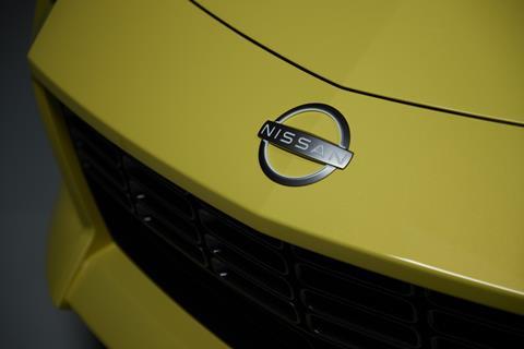
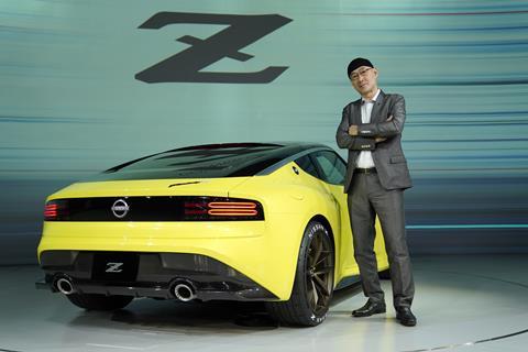
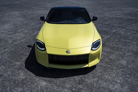
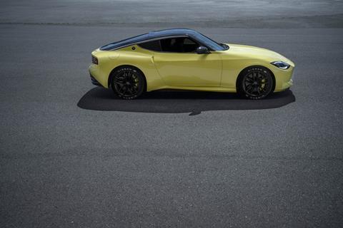
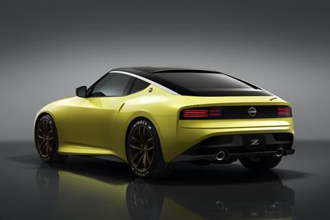
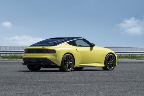
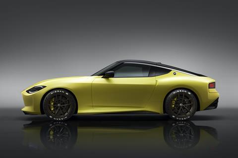
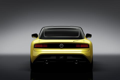
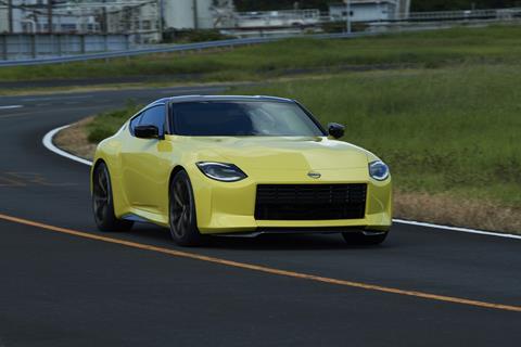
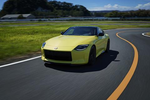
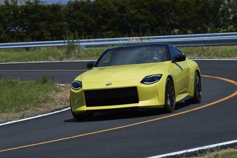
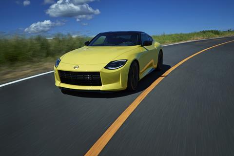
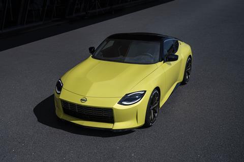
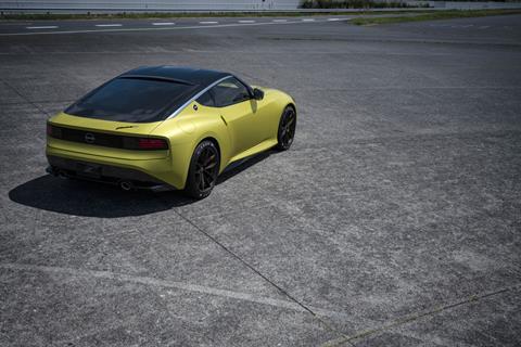
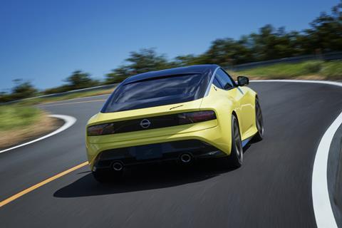
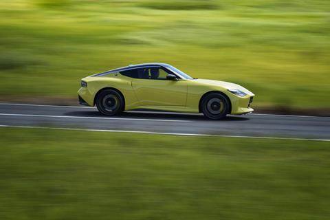
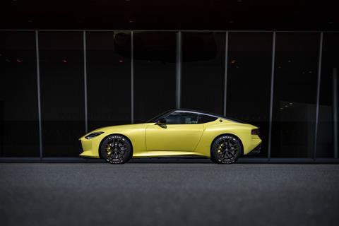
Our only disappointment about the new Z is that the colour, which we trust will look fantastic in natural daylight, seems tricky to photograph. The volumes on the hood around the power bulge, and the crease line which tapers down along the side of the car are frankly difficult to see without some very specific photographic conditions. The colour does, however, reference the iconic 240 Z, the 300, and communicates the sporty credentials of this little sports car. The overall sillouette and shape, particularly the long bonnet and sloping roofline, are thrown into sharper relief by the block colour and absence of fussy lines and creases. A lot of concepts we have seen of late have heavily referenced the 1980s - Nissan reminds us that the ’90s were a pretty cool decade too.
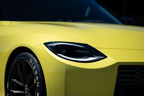
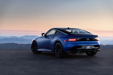
Z Proto exterior gallery
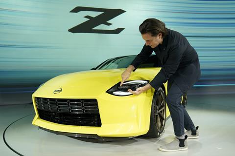
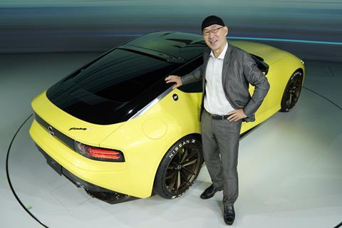
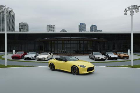
The ever-charismatic Alfonso Albaisa introduced the Z Proto with a story about seeing the 240 Z in Miami in 1970 (as a child) and also about his first trip to Japan after joining Nissan and seeeing a clay of the 300 in the studio: “I just wanted to go home and restart my life, it was so modern, I couldn’t believe it.” And those cars both informed the design of the Z Proto.
“One of the key points is that as you get up close, the volumes, the hood bulge and the fender must be higher than the trailing edge of the roofline,” said Albaisa. The low centre of gravity is key, and once the engineers and designers had achieved that with the roofline, the ‘katana sword’ accent on the roofline and the sculptural crease line tapering down “allowed this car to feel like a cat that is ready to pounce,” he continued.
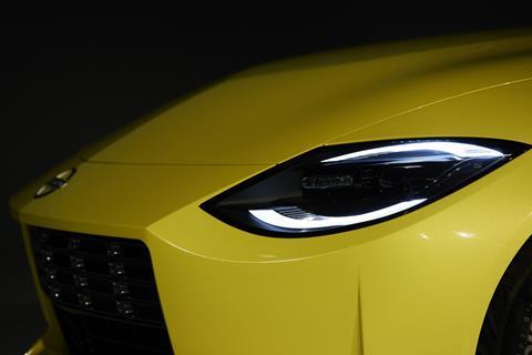
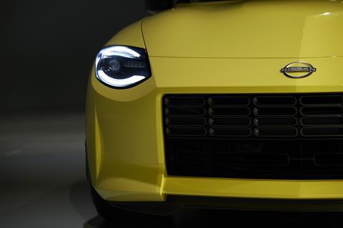
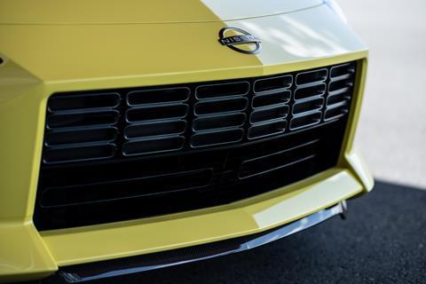
At the front the bonnet bulge is softened with soft forms around it and the classic 240 scooped out headlamp combine with the grille to create a pleasing, distinctive whole. “We thought about to make the headlamp feel like tomorrow but also invoke some memories and took inspiration from the special version [of the 240] that came out a few years later where they put a clear lens on the 240 and in the sunlight the reflections around the car broke the pure circle of the headlamp into the two. Ultra modern technology, but feeling like the 240.”
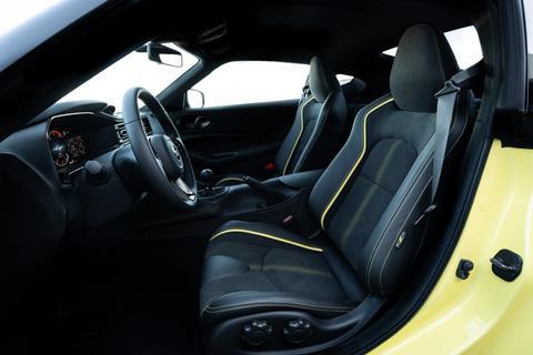
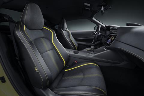
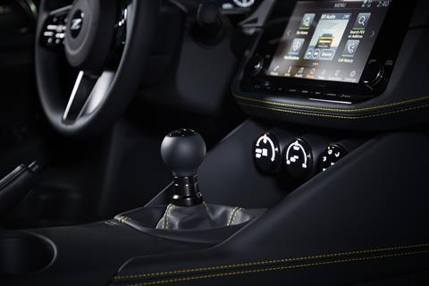
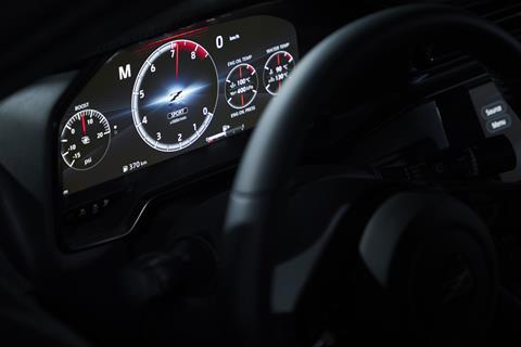
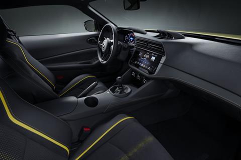
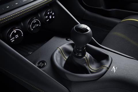
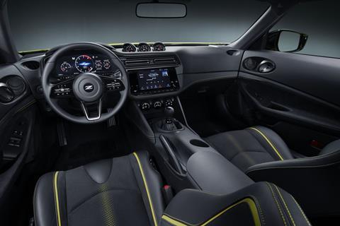
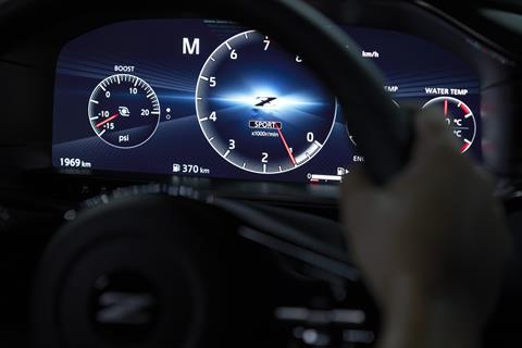
Inside, the Z Proto uses the statement yellow as an accent colour piping and stitching on the seats, and the horizontal layout is “purposefully about performance” Albaisa said. “We took the purposefulness of the 240 [interior] and wrapped it around the body, when you get in you will feel the car around your body. All the elements are at eye level so when you are driving you can keep your eye on the road.”
We will, of course, bring you more on the Z as we get it, in the meantime, here’s a quirky video from Nissan that has some lovely sketches as backdrops.









No comments yet