Getting under the light-bending skin of the new Kodo hatch
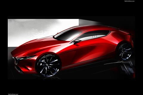
Having established its award-winning Kodo design philosophy in the outgoing generation of models in its range, Mazda is now taking the themes and philosophy that it feels embody “soul of motion” and pushing them to the next stage. As an upshot of this, the new Mazda 3 – previewed in 2018 by the surprisingly exotic-looking Kai concept to which it’s largely faithful – is its own kind of bold, especially in hatchback guise with that C-pillar.
It’s bold too in shunning some of the main conventions now adopted by its peers, instead taking on a slightly more abstract and cerebral approach to surfacing, plus a more tactile approach to interior UX which at this point is almost an anti-fashion statement in itself. To understand how well this all translates to reality, we spent a week in a Skyactiv-X hatchback.
Exterior
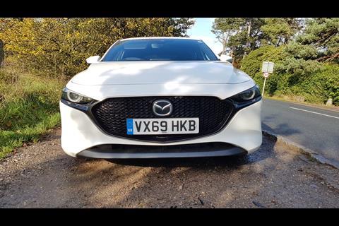
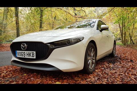
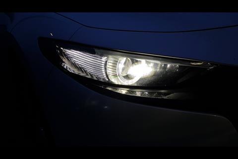
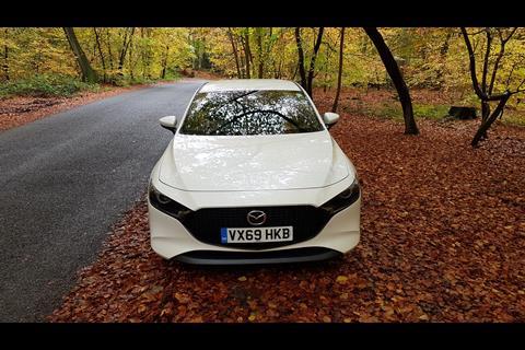
Starting at the front, the DRG is a strong one and works well, especially with the black trim option linking the mostly open heptagonal grille to the narrowed gaze of those LED headlights (one onlooker called the look “quite animalistic”). The ‘cheeks’ either side that tuck in and then flare out at the bottom, on the other hand, are more sensitive to the viewing angle and lighting conditions – a recurring theme all around the car – and can at times look a little droopy.
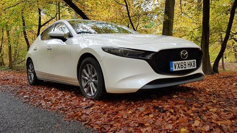
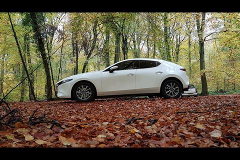
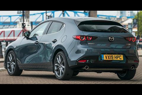
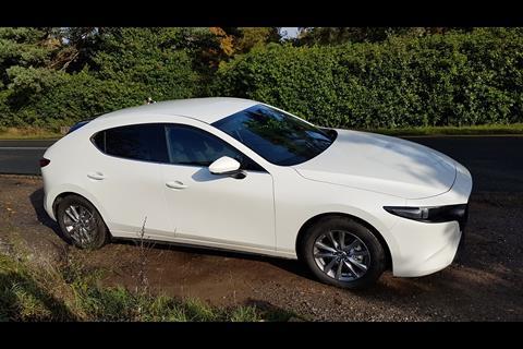
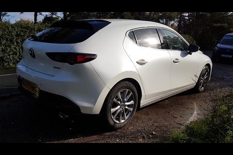
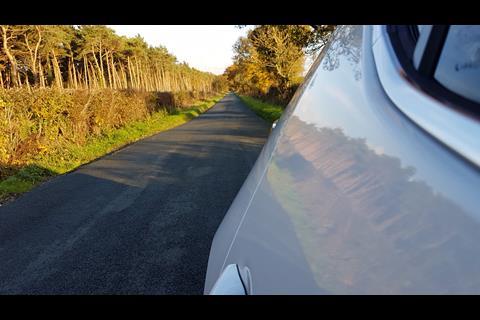
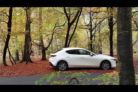
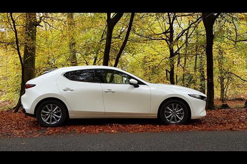
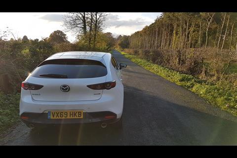
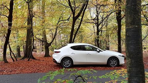
The key USP of Mazda’s second-stage Kodo exterior design is a bodyside which “sculpts with light,” by foregoing sharp creases and ornaments in favour of carefully-judged concave surfaces which bend the shadows and reflections to the designers’ will. This works brilliantly in a well-lit studio or carefully arranged press photo. However, in an Autumn which mostly flits between harsh low-angle sunlight and dull cloud, much of the effect is lost. Our test car’s white paint, which naturally flattens some of the surfacing’s light and shade anyway, didn’t really help either.
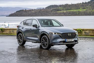
– Press photo versus reality
There were just one or two occasions where we successfully saw the effect working, but otherwise, without any real ‘light sculpture’ to examine, the bodyside consequently looks rather plain (and relatively chubby for a non-crossover). That said, take in the whole profile as one and the overall proportions, with the long-looking nose, raked roof and narrow DLO, still lend it a fairly low-slung and more upmarket appearance – perhaps more so than we’re now seeing from its German C-segment rivals, in fact, which don’t manage to look quite as sleek and almost cab-rearward as this does.
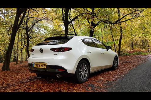
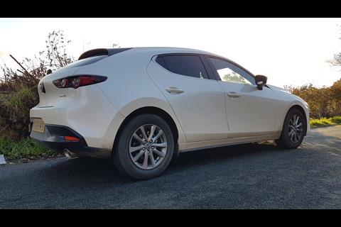
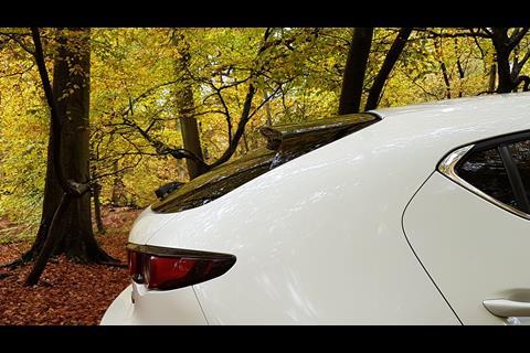
But it’s the C-pillar that has been the main talking point around the Mazda 3 hatchback’s design. This large expanse of not very much is all but flat; the area above the rear wheel runs in what reads as a straight line from the roof to the wheelarch eyebrow, completely unbroken. It is certainly unconventional and, combined with such a shallow rake and long black spoiler in the rear window nearby, is at times vaguely reminiscent of the Alfa Romeo Brera – only with much less definition.
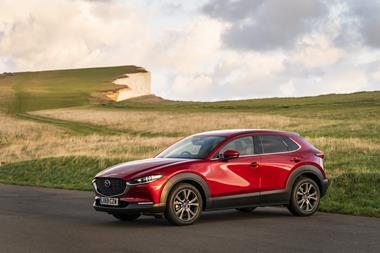
At times it looks cleverly minimalist and helps create a beguiling view. At other times, and at certain angles, it instead makes the rear appear to sit heavily down onto its wheels, like the car’s dropped its shoulders and sighed – leaving you wondering whether a bigger DLO filling more of the space would’ve balanced it better (compare it to the platform-sharing CX-30 crossover and decide for yourself).
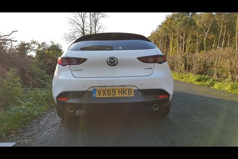
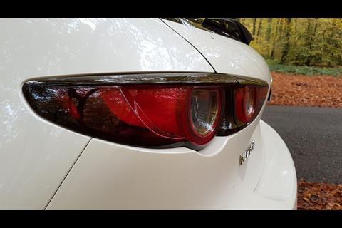
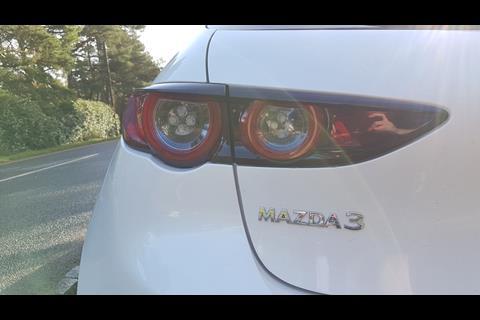
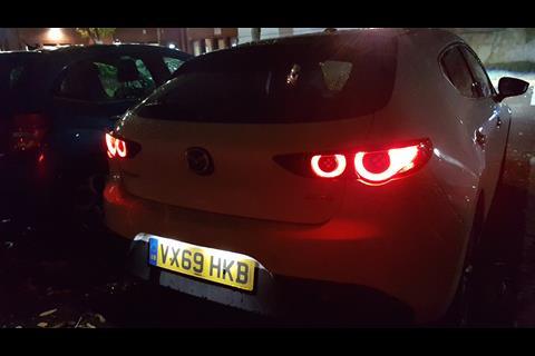
More consistently successful are the intricately defined elliptical taillight clusters, which punctuate a curvaceous but otherwise featureless area of the body while producing a very strong night-time signature.
Certainly, this is an exterior which takes more than one look, on more than one day, to really understand and appreciate… as evidenced to some extent by the frequency with which it turned heads out on the road – heads we suspect wouldn’t have turned for a current Golf, Focus or A-Class. It equally seems to require a deep, metallic paint finish to do its best ‘sculpture work’ (Soul Red Crystal, for instance). All this could be considered good news for visually-minded buyers, who may keep on finding it interesting with each new turn of the weather.
Interior
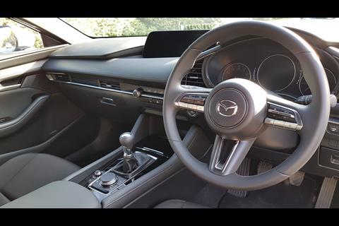
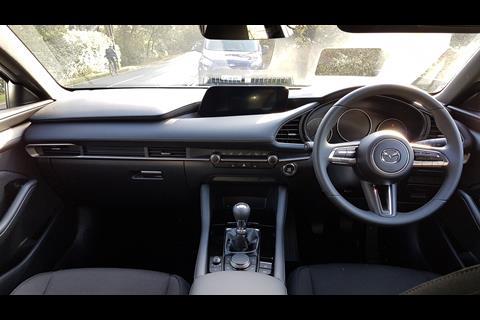
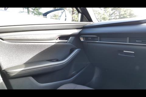
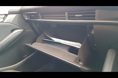
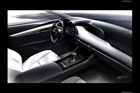
There is a bit more of Mazda’s subtle sculpture inside as well, although since the interior’s almost entirely covered in black soft-touch materials, it’s not for cunning light-bending purposes here (red leather is available though, if you’re feeling wild). Instead it’s mostly about neat layering. This is created in part by stacking different materials on top of each other; textured vinyl sits on a convex beam of plush leather, which sits on smooth solid plastic punctuated by a full-width silver strip running through the HVAC controls and underlining the passenger air vents – which in turn sit directly above the positively cavernous glovebox.
There is a genuinely premium feel throughout the cabin, with the only cheap-feeling parts being the bottom spoke of the steering wheel and the ‘elephant-skin’ vinyl on the dash top that’s betrayed somewhat by the soft waxy leather directly underneath it. Neither of these are things one touches often when not conducting a review. The seats (humbly manual and fabric in our test car) offer good lumbar support and we found it easy to create a comfortable driving position.
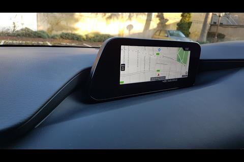
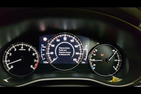
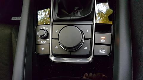
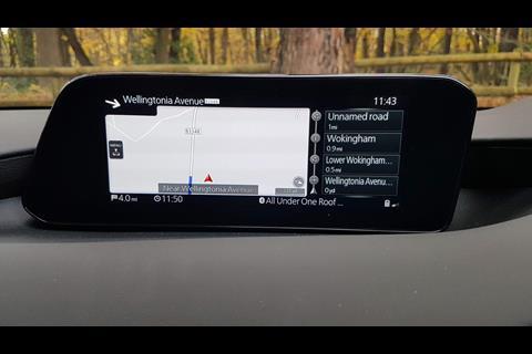
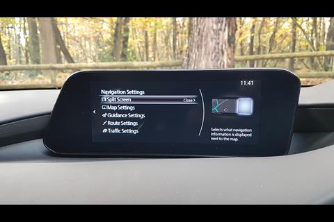
What the interior does not have, very deliberately, is a large touchscreen – instead offering a high-mounted seven-inch widescreen TFT unit controlled by the tried and tested method of buttons, switches and iDrive-style rotary controller (sadly not shaped like a 13B rotor). Similarly, the mixed-media IP combines analogue needles and digital graphics, with the central speedometer being the only entirely virtual dial as it circles around a variable centre graphic.
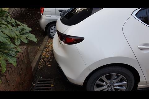
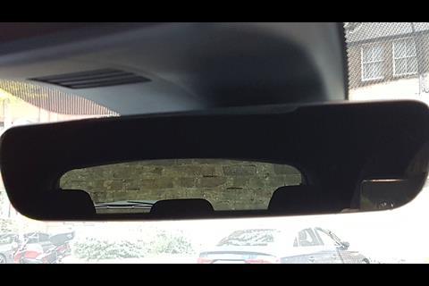
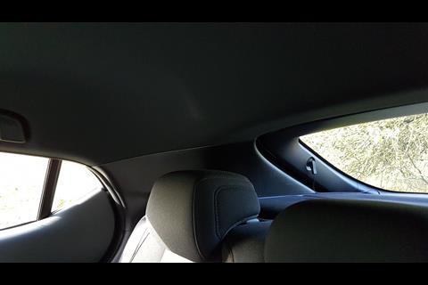
One less successful aspect we need to address is, again, that vast C-pillar treatment. The rear window is even smaller than it looks from the outside, so thick is its black border. The entire window hardly fills the interior mirror, so to speak, and while it’s far from useless, reverse parking (without a camera onboard – only distance sensors) nevertheless proved to require a certain amount of ‘using the force’ instead of seeing where you’re going. Not ideal.
HMI and UX
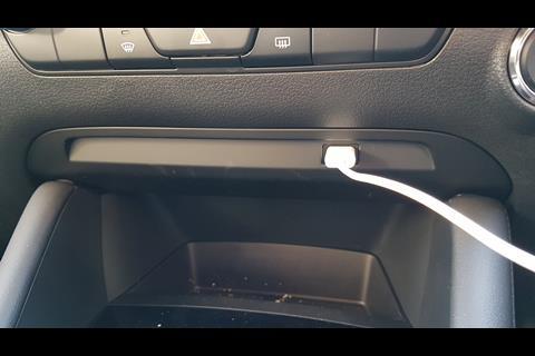
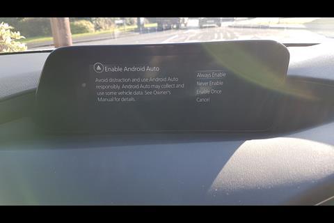
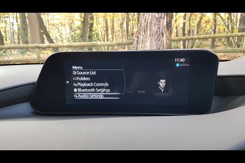
But in a time when migrating as many controls as you dare onto an all-encompassing central touchscreen increasingly seems like the industry’s default setting, for Mazda to consciously choose to forego a touchscreen entirely is as bold as it is admirable in its defiance. And quite honestly, the logically applied clickwheel-and-buttons approach never had us yearning for a vast glossy tablet at any point in our test week… well, except maybe for entering a sat-nav destination. Oh, and having to operate Android Auto by using the phone itself isn’t safe on the move either.
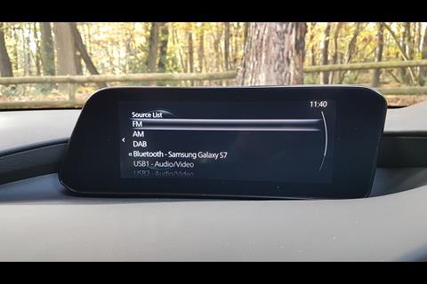
The Bluetooth connection, however, was faultless and allows you to access your music via the car’s own on-screen Entertainment app – although all the folder-diving for that is still best done either when stationary or by a passenger, given how long it takes.
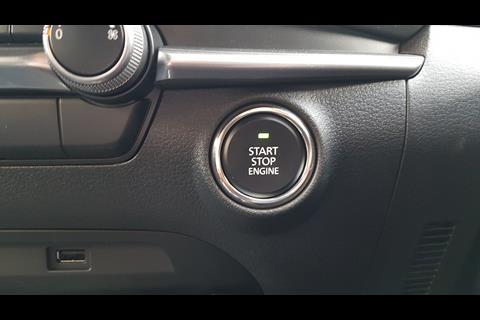
The physical buttons are logically laid out and the main ones are easy to commit to muscle memory. Plus, if there are any controls that don’t make sense, the car’s on-screen manual has a handy ‘what does this button do?’ function that finds and explains each and every interior feature you’re looking for (again, when the car is stationary).
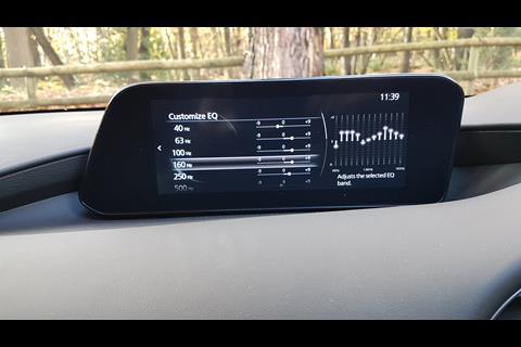
Audiophiles may find the standard stereo clear yet a bit average, but will then revel in an equaliser that can be adjusted in three levels of depth: standard genre-specific profiles, individual bass and treble sliders, and even the chance to balance different frequency bands like you’re at a mixing desk. We just settled on turning the bass up a bit to combat the mild motorway hum…
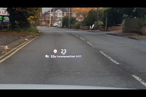
Our car featured a head-up display showing the speed, navigation instructions (if you’re using that feature), plus an icon displaying the current speed limit – although beware that the limit it showed us was occasionally wrong, sometimes optimistically so, which could get you caught out if the police are watching… so don’t depend on it and keep checking the real signs for yourself. The HUD’s height and brightness can be adjusted in a settings menu, but it otherwise displays as if it’s floating right at the tip of the car’s nose and is very clear in most lighting conditions.
Overall, the simplest summary we can give of the UX is to say that, at almost every stage, it feels thoroughly thought through by a team of people that have considered as many potential interface issues as possible and duly addressed them in advance – although some aspects of the phone integration still weren’t brilliant for those driving solo.
If only new cars always felt this easy to use.
Driving
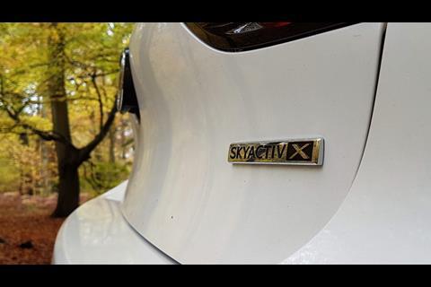
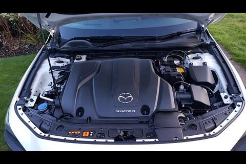
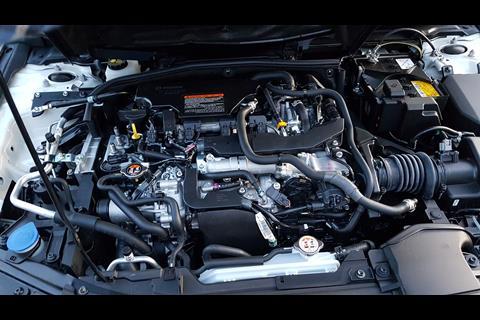
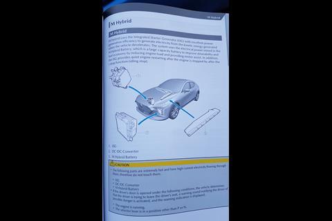
The Mazda 3 is the first model to use the company’s potentially revolutionary Skyactiv-X technology, which means we’re now duty bound to summarise how that works. The pivotal part is the spark plug-controlled compression ignition (SPCCI). This petrol engine predominantly burns fuel like a diesel engine does: by just squashing it. But to create the conditions needed for that to work with petrol, after the main, lean mixture has been injected and starts compressing, a little squirt of extra, much richer mix is added in at the latest possible moment and sparked. The heat from that little sparked explosion allows the main mixture to then be compression-ignited, which is markedly more efficient (99g/km CO2 is claimed for this 2.0-litre petrol engine). This is then combined with a 24v mild hybrid system providing stop-start hold in traffic, plus regenerative braking and coasting.
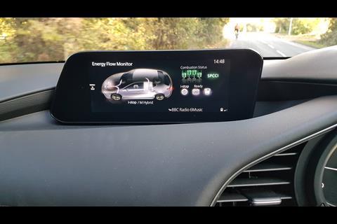
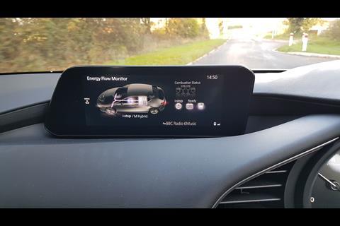
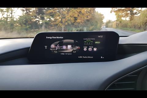
A nerdilicious ‘Energy Flow Monitor’ lets you, well, monitor the flow of energy back and forth between all these elements and the front axle. A four-piston graphic also shows whether the engine is doing its SPCCI (green) or combusting petrol the old-fashioned way (red) – the latter only really occurring at idle and during full-throttle acceleration. It also suggests that when coasting, the engine doesn’t inject any fuel at all.
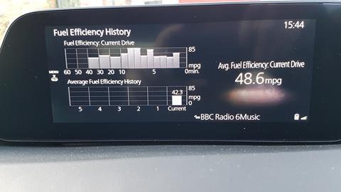
Mazda claims the manual 2.0 Skyactiv-X on 16-inch wheels can achieve 51.4mpg (combined). After a week of commuting in and out of London in mixed city, motorway, suburban and countryside conditions – plus some other errands and testing – we were on course to get approximately 430 miles out of a 51-litre tank of petrol, meaning an overall average of… 38mpg. Not so revolutionary then.
Perhaps some less spirited driving in places would’ve made the difference… although we can tell you that, despite diesel-like ignition, the naturally aspirated engine is still petrol-like in its response and still needs revving to really perform. There did seem to be a strange hesitation when trying to make a quick getaway from rest – almost like it took time to switch out of hybrid drive near 2000rpm, or something similar – but otherwise it pulled smoothly and willingly, albeit never spectacularly so. The manual gear shift is well positioned and has a nice short throw, but was a tad notchy for us.
The ride never truly isolates you from the road surface, but it does cushion you against everything very effectively – particularly in longer compressions over dips and hills where it benefits from a relatively long wheelbase. It may have helped our test car’s cause that it’s running 205/60-profile tyres around its modest 16-inch wheels, which would theoretically give a little more of an air pillow in exchange for their lack of visual impact.
The steering is fingertip light at town speeds but always laser-accurate… and always lacking in meaningful feedback. Body roll is well managed, but the car does feel heavy at times, which it arguably is; the Skyactiv-X version weighs 1411kg (claimed kerbweight minus their 75kg assumed driver mass), which is 47kg heavier than the conventional standard petrol version. Weight, don’t forget, is the enemy of efficiency too…
Summary
On many levels, the Mazda 3’s design is not so much one for those needing instant gratification, the upshot of which is that it stays interesting the longer you spend time around it and getting under its skin. Having spent a week’s worth of that time, we feel it’s a genuine alternative to consider for those who don’t want to default to a Golf or A-Class but don’t have a taste for crossovers either. It’s engaging before you even start the engine, and then when you do it gives you a refined but finessed driving experience and an intuitive media interface. Just make sure you get it in a good colour.












No comments yet