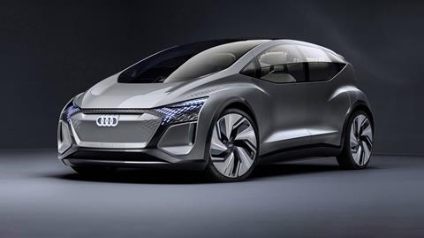
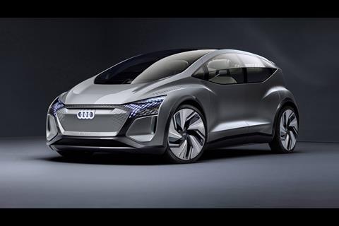
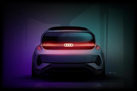
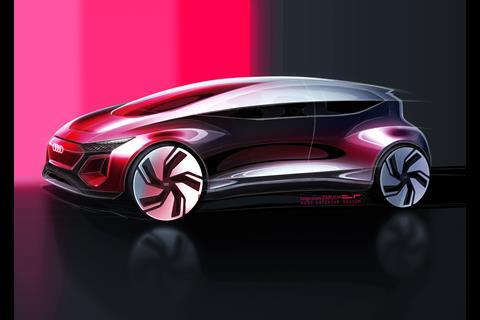
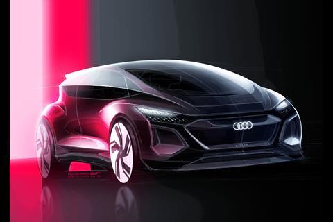
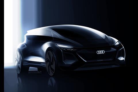
“As we move forward into the future of mobility, we want to put the customer more in the centre of what they have access to,” said James Nissen, lead interior designer of the AI:ME, showing CDN Audi’s Shanghai motor show concept prior to its shipping to China.
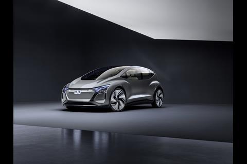
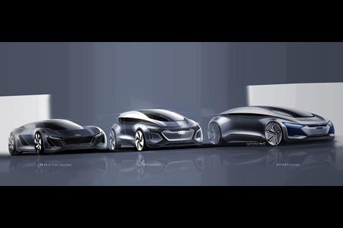
AI:ME is the third of four related concepts, each with specific use-cases in mind, following the autonomous Aicon (Frankfurt show, 2017) for inter-city long-distance commuting and the track-focused PB 18 e-tron electric supercar (Pebble Beach, 2018); it is, he said, “what an Audi could be in an urban inner city context” – a compact [4.3m x 1.9m] shared, on-demand vehicle seating up to four. Audi is proposing a mobility system whereby customers can pick and choose vehicles to use in different scenarios, and the fourth concept in the family will be revealed in September.
AI:ME was guided by use-case research, and although developed and built in Ingolstadt, it was informed by early-stage collaboration with Audi’s satellite studio in Beijing and talks with typical Chinese customers – who expressed a preference to relax and escape from the mega-city and didn’t necessarily want to work on the move, more a European phenomenon. “They wanted to connect with people around a more open and social space,” said Jens Granitza, user interface designer. “The wellbeing topic also came from this.”
“We needed to really focus on holistic experience and every aspect of the usability,” said Nissen. “Firstly, to focus on enabling seamless and effortless personal freedom to the people who use it [AI.ME]; it has to be many things to many people, and it has to allow all of them to do what they want. Secondly, to take the opportunity to create a solution to focus on and prioritise health and well-being for commuting.
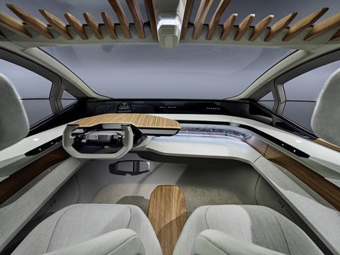
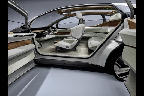
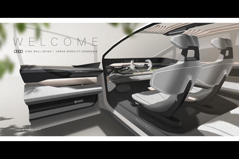
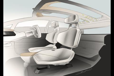
“This begins from the moment you open the door; you have to create the space in a new way for an automatic sense of relaxation and calm, moving away from a performance-based environment. It begins with simplifying, only including things that add real value and benefit, and with really enhancing the feeling of material quality, extremely important going forward.”
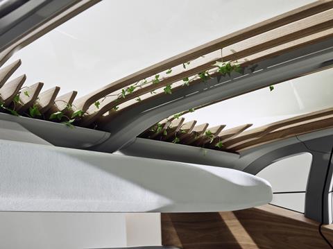
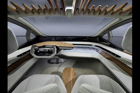
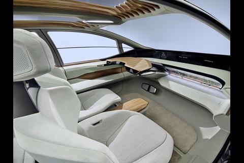
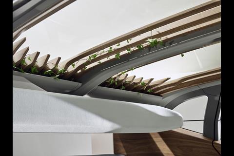
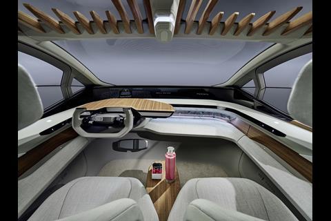
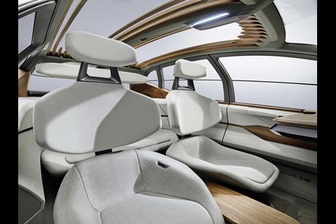
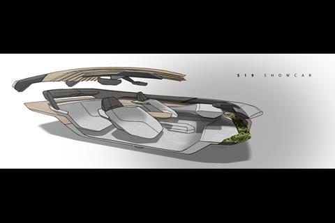
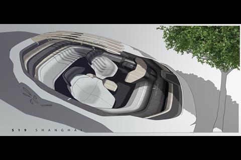
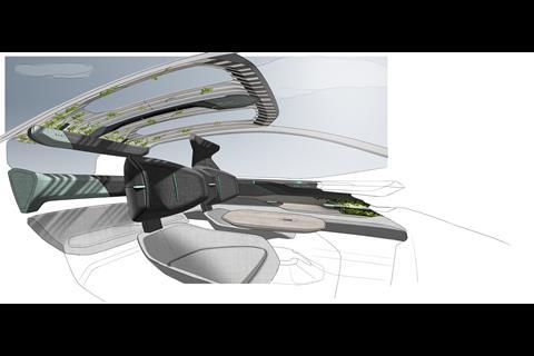
Natural elements were especially important – and the (real) green plants contained deep in the IP and entwined over the pergola-style wooden slats in the roof send a key visual message. “The idea of detoxing, purification, is very important in the mega-city context,” said Nissen. “The cabin is a filter from the city, a cocoon, very clean and pure.”
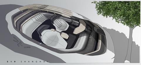
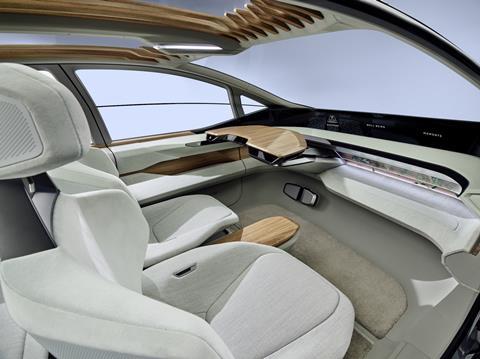
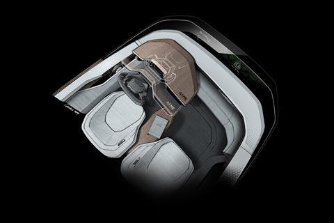
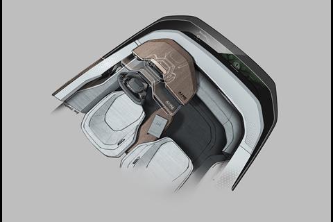
Storage is accommodated within a lower ‘comfort layer’ running around the cabin, on an inward-sloping shelf – everything is easily seen and accessible, so people are less likely to leave their mobile devices or other possessions behind in this shared vehicle. This leaves the interior more open: “We designed a space that allows all user scenarios,” Nissen said.
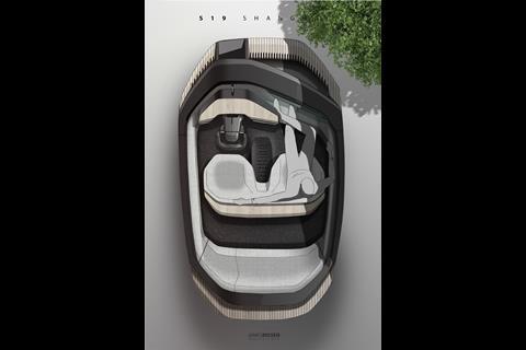
“All the tech and controls are pushed to outer areas, all the control elements are in ergonomic spaces, but we created freedom in the interior so people can move around. We need to have certain surfaces and features that they can manoeuvre; the two middle elements can be configured in a number of positions.”
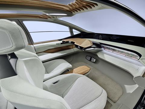
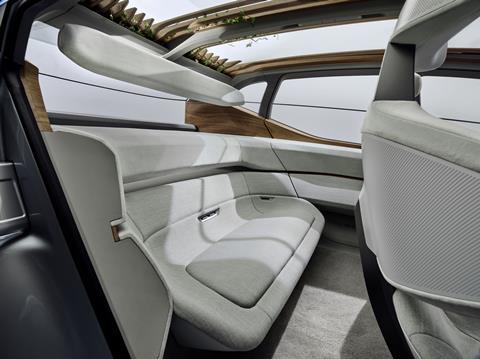
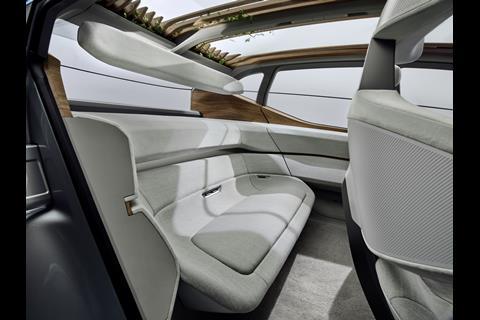
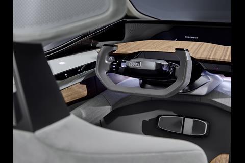
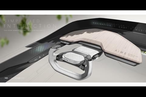
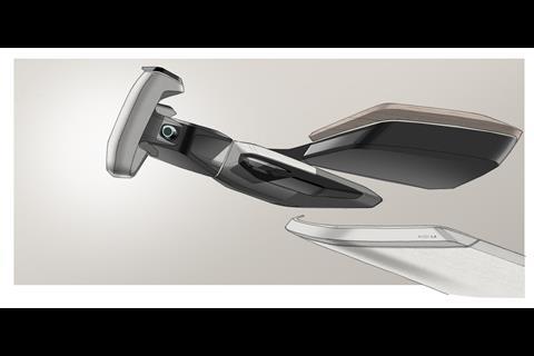
Given that AI:ME has Level 4 autonomous-driving capability, the steering wheel folds away to enable an open table surface; and the centre console can be raised or lowered to facilitate interaction or to form a platform between the front seats; metal coffee cups and drink-containers are held in place on magnetic pads, rather than in easily-dirtied recesses. Rear seats are laid out as a low-set bench to give a homely, lounge-like feel.
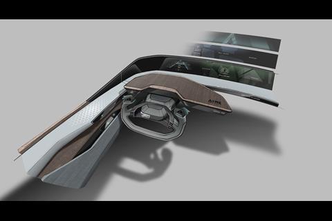
The upper ‘tech layer’ takes an interface and technologies like those of the Aicon, Granitza explained. Eye-tracking sensors – one for the driver, another for the front passenger – can be used in autonomous mode to move and select from the control menu in the front display; speech recognition activates an animated digital personal assistant; and the door panels feature embedded touch panels and gesture sensors which follow the hand in a natural position. For individualised settings, “you can bring your personal device into the car and AI:ME will load all preferences,” Grantiza said.
The curved black OLED screen gives an impression of real depth, with imagery projected in two layers. “It looks like a 3D display, but it’s actually mirrored,” said Granitza, noting that these techniques were explored in the Prologue concepts (2014-15). “The Aicon also used pillar-to-pillar display, but with an AR projector; it’s further into the future, but this one is more viable. We cannot use the windshield [as a display], there are regulations to solve, so this is more realistic tech.”
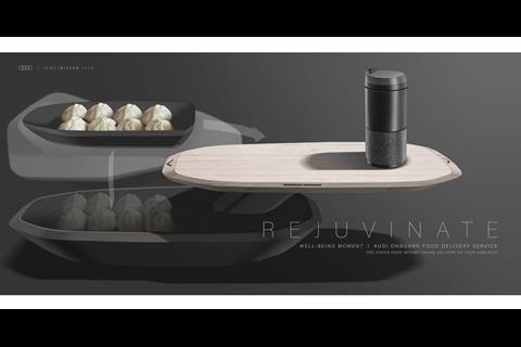
A ‘browse feature’ for images and social media feeds, a screen for movies, gaming or a VR experience (as seen in Audi’s Holoride concept at CES, 2019) are all accommodated – and a camera in the centre of the IP to take, and then upload, selfies. The GUI and its visualisations are, where appropriate, animated and playful: from relaxing imagery of trees and candles to the ‘food’ submenu, whereby users can order a takeaway meal along with the vehicle itself, to eat on the move.
The 360-degree wraparound sound bar in the tech layer enhances the in-car entertainment but also features active sound cancellation – either for audio quality or to aid a sense of peace and quiet. “On one side, it can be immersive, but on the other, cancel the sound from the city outside,” said Nissen.
With the screen a focus of attention, the ambience is otherwise calm and minimal, the large windows and light colours maximising the sense of space. “We wanted to evoke an environment that was familiar, a safe place,” said colour, trim and materials coordinator Annamaria Palmigiano. “We had to think about the psychological factor, diffusing the resistance to handing over to AI.”
Since tech can be overwhelming, she said, a human touch was important, and “a balance between warm and cool, materials that are tactile and have feedback, not really automotive. Once the driver is freed from the purpose of driving, the cabin is repurposed, so we wanted a subliminal hint of an environment related to interior design.”
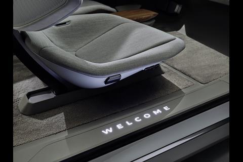
Palmigiano pointed to a soft velour on the upper parts of the seats, contrasting with a textured wool-polyester mix textile, and Corian (a composite usually seen on kitchen work surfaces) on the door rails: “easy to clean, not cold to the touch,” she said. “Then the wood [an open-pore walnut] warms up the selection of colours, with a natural treatment. We respected the materials for what they are.” The soft carpet, easily removed for cleaning or mending, is a highlight: a textile “upcycled from fishing nets that have been recovered from the ocean, pollution and waste turned into a premium-level product.”
“The element of nature is something that underlines migration of forms from outside to inside, we brought nature inside,” Palmigiano added, saying that the plants “are anchoring you onto something well-known” and that the colours were picked to be reassuring and reduce stress: “this meditative idea, you can recompose your thoughts”.
“Everything was designed from a functional point of view for optimising the interior,” said Nissen, though he stressed that an attractive exterior design and strong on-road presence are still important, and “still a very personal statement”.
Exterior
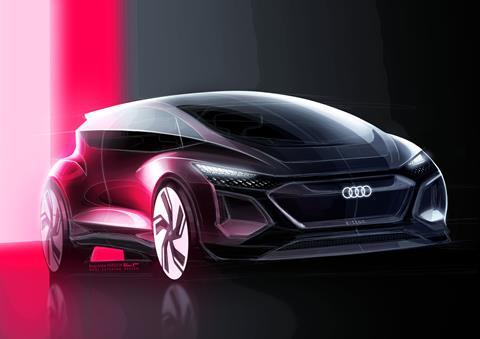
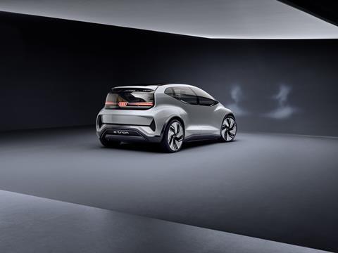
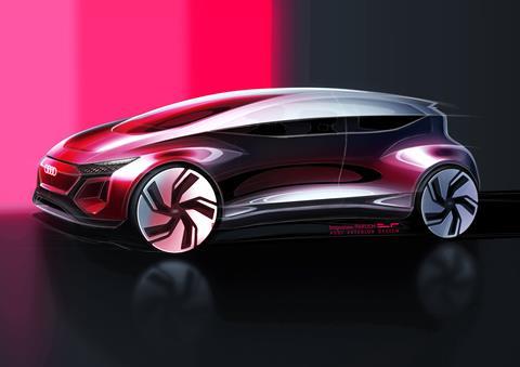
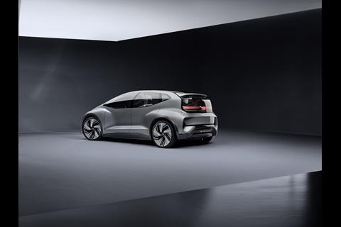
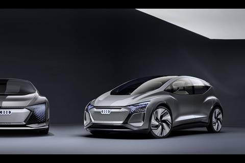
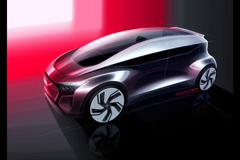
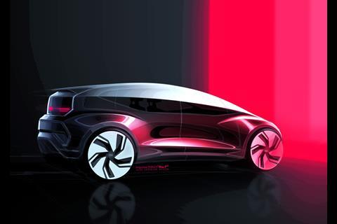
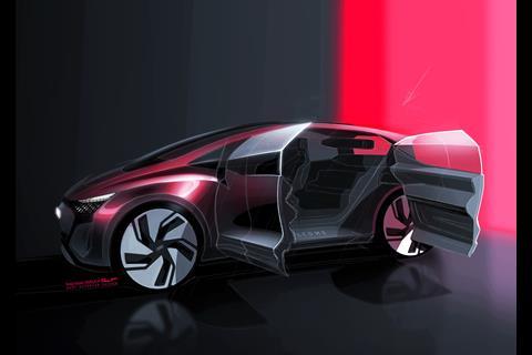
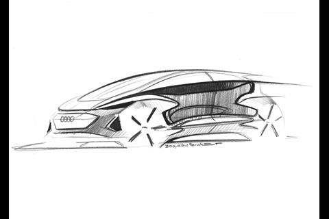
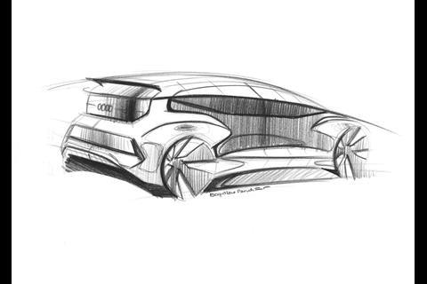
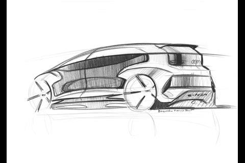
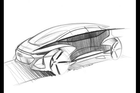
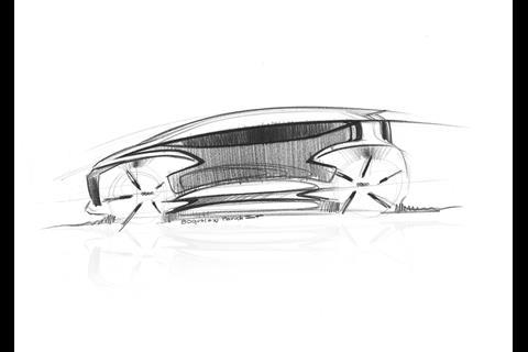
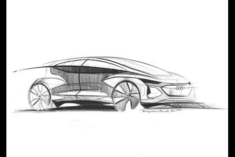
Head of exterior design Andreas Mindt explained that “the basic architecture was the solution to make a high car [1.52m] attractive. The line split is the trick. There is one clear-cut line running around, dividing it in a new way.” This full-length horizontal, sharp-creased line divides the electrochromatic glasshouse into upper and lower sections.
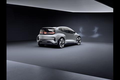
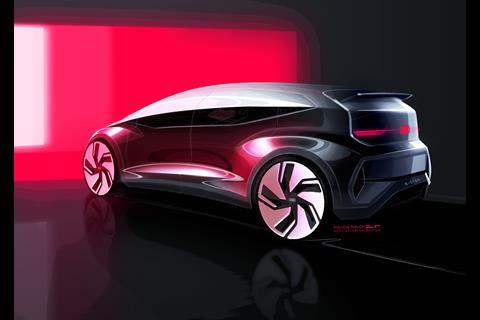
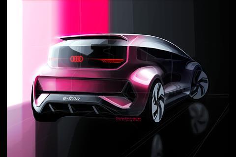
“The side panel is very important: it gives more space to the side of the head, the widest point is where your head is,” he pointed out. “The top of the glass is always closed; the lower element can go into the door, open when air is wanted, and not on the head but lower. The window cut-out is really low, good for visibility.” The DLO kicks up towards the C-post and Kamm-style aerodynamic tail.
“Everything is connected to this one line running around the car, like the C-post, it turns on this point. Everything is in reference to this line and follows a certain logic. All lines connect and sweep,” said Mindt, indicating the linking of the forms and masses. These include, in the side, “quite a deep scoop, quite a lot of 3D – super-simple shapes, and a very flat door from the crease downward. I think this is the next step for us, to simplify everything. We will see some cars in production going the same way, but we want to have it very sharp.”
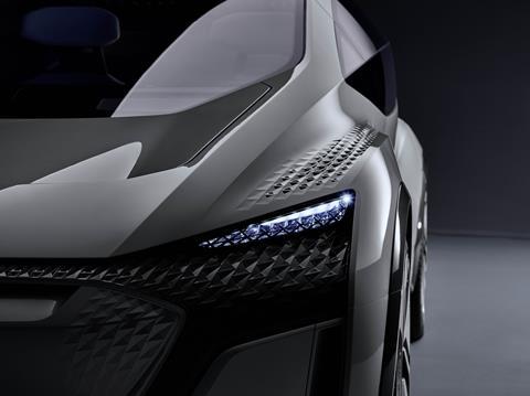
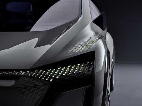
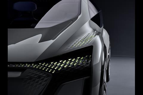
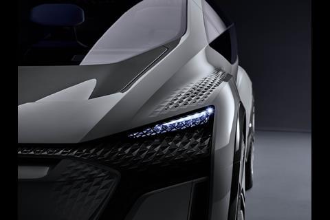
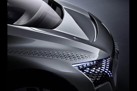
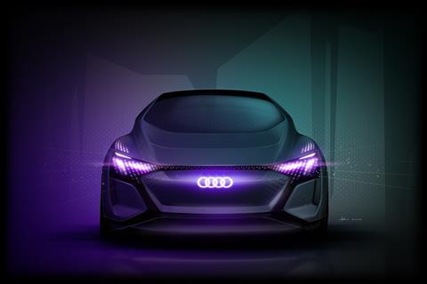
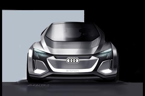
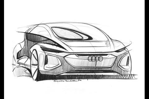
The basic shape of AI:ME is quite familiar and simple – Mindt described it as “one volume in the middle, four exposed wheels; we want to keep this sitting on four wheels” – and its surfacing relatively restrained, but detail comes with the underlit 3D patterns applied over the wheel arches, fenders, and across the front grille. These were generated using the Grasshopper graphic algorithm editor, Mindt said.
“The program runs over the data, you have a frame, then you give it parameters for the size of the LEDs and adjust the program till you like it. Part of it is AI.” Getting the fade-out effect and the pattern right around the shutlines were part of the initial learning process, he admitted.
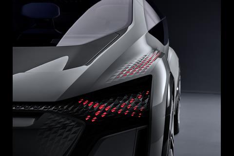
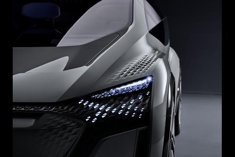
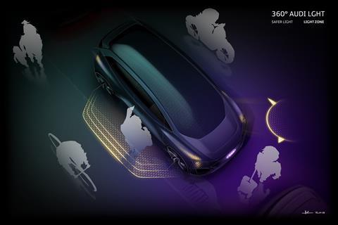
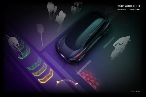
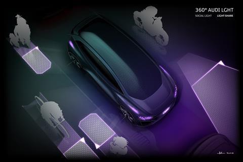
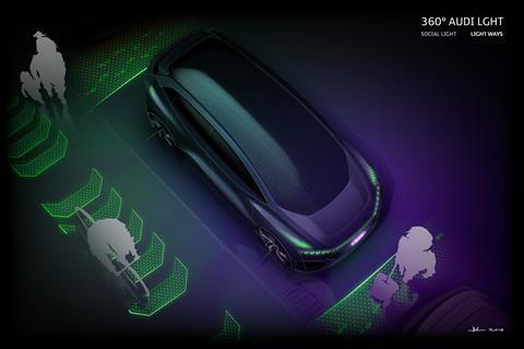
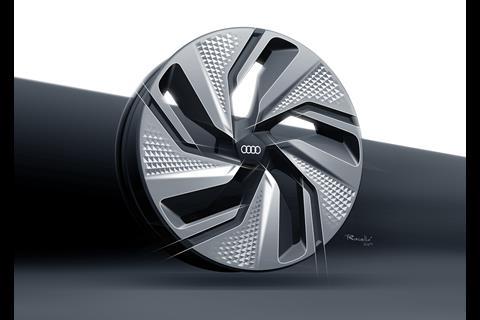
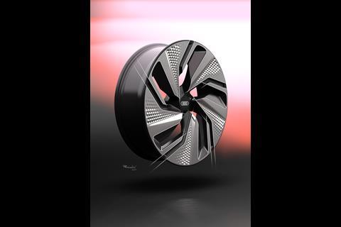
Lighting is a key part of AI:ME’s identity, and indeed, plays an important role in its communication with other road-users in the city, especially when it is operating in autonomous mode. “Where there’s not so much space, people with different needs – pedestrians, on bicycles, in other vehicles – need to communicate,” said Cesar Muntada, lead lighting and wheel designer. “We have typical LED matrix lights, but we decided to put information a level higher, to lay it on the upper surface of the car, 360 degrees, so you can understand what the car is doing.”
The LEDs flash in different colours – red, green, yellow, blue – and pulsate to indicate the intended direction of travel or approach angle, for example, or project onto the road ahead or behind to give information or signals. “You can light the road for other users. We’re interested in the social aspect of light, addressing everybody, to make the road safer,” said Muntada, who echoed the triangular arrow-head pattern of the lights in his design for the wheels. Service users could choose their own light signatures to recognise the car coming to them when ordered, he suggested.
Appropriately, the Shanghai show car is presented complete with its app – a ‘digital clone’ – to experience both AI:ME and a mobility service within which it could operate.

